I’ve been working on my forum website makeover for most of today again. Because I border on being OCD when it comes to how things look, I spent several hours designing a set of iPhone style buttons, just so I could replace a couple of minor buttons on the forum interface --as the built in ones were putrid Windoze style crappy gifs.
I didnae design these from scratch, but based them on an iPad GUI template set very helpfully published by these folks. What I did was; reposition all the graphics to make them easier to slice for the web, redid the Layer Masks to make each button oval instead of the original square, and I also created a new graphic [the one with the speech bubble] to serve as a “Quote Post” button:


I also made some smaller versions:


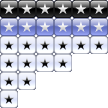
Last night, I spent a similar amount of obsessive energy, creating these star icons to replace the forum’s default User Ranking buttons, which were ‘pure minging’

Apart from that, most of the rest of today was spent hacking my way through the forum software template files and tweaking the CSS, for which --as ever-- the two vital weapons in any web-monkey’s arsenal were indispensable:

&

