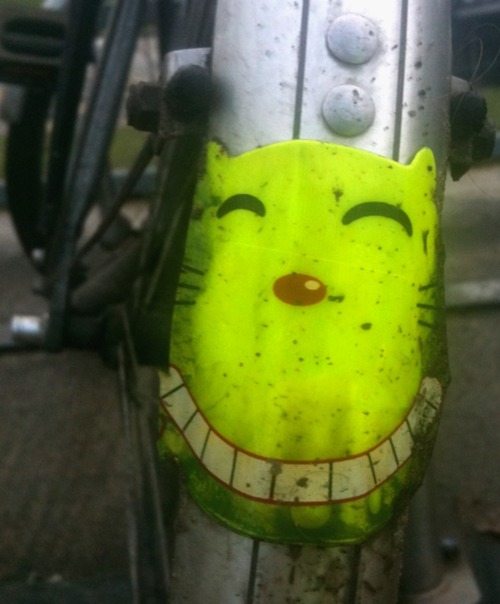
I spotted this ‘Be seen in the dark’ sticker on a bike outside college before. Nothing particularly interesting about it, on first appearance, but my curiosity was idly piqued by the choice of a Cheshire Cat, as opposed to any other cartoon animal or object.
Then I remembered the characteristic of the Cheshire Cat in Alice in Wonderland:
when [Alice] noticed a curious appearance in the air: it puzzled her very much at first, but, after watching it a minute or two, she made it out to be a grin, and she said to herself `It’s the Cheshire Cat: now I shall have somebody to talk to’
Lewis Carroll
In Alice in Wonderland, the Cheshire Cat tends to materialise out of thin air and it’s always his smile which appears first, before the rest of his body. What better metaphor to use for a sticker which is designed to appear out of the darkness and warn you that there is a cyclist approaching?
I love it when something so apparently simple turns out to have been so cleverly thought out. It just reinforces my belief that, while artistic ability is great to have, Good design always begins with good ideas.
