Yesterday I made my, by now annual, pilgrimmage to the Bradford Animation Festival at the National Media Museum, to check out the latest goings on in the world of student animation, through the two Student Showcases.
Overall, I found this year’s offerings a pretty mixed bag. There was some great stuff and some not so great and on balance I think the quality was ever-so-slightly better last year. However, it was a pretty decent show and --with so much production-line CGI about these days-- it’s always nice to see some good ol’ fashioned hand-crafted animation and imaginative use of materials and techniques, for a change.
Anyway, there’s no way I’m going to write an in-depth review of every film in both showcases but here is a brief summary of my opinions of the various films on offer --as deciphered from the hurried notes I scrawled in the dark, while watching the proceedings.
Student 1 Showcase
The Kiosk
Crudely rendered figures. Cut-out puppet style animation. Nice attention to detail with a lot of small vignettes happening in the background. Well-observed characters with personality. Warm, humorous storyline.
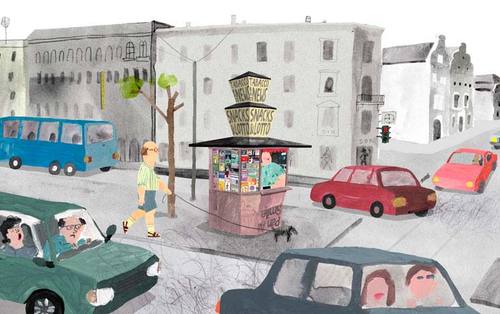
VERDICT: I liked this one. Probably my favourite.
The Bungled Child (La Ravaudeuse)
Crudely made cloth puppets --quite sinister looking. No attempt made to hide hand-stitching. Quite a dark storyline. Clever use made of ‘off-camera’ action to avoid need for complex animation, for example the ‘cutting open the womb’ and ‘snipping apart the twins’ scenes.
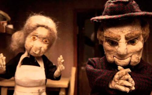
VERDICT: I quite liked the puppets and dark feel, but the story didn’t grab me.
The Carousel Family
CGI. Quite surreal story-line. Found the CGI a bit dead, lifeless and a bit creepy looking. Was this deliberate? Characters seemed lacking in personality. I think it’s hard to inject personality into CGI when ‘done on the cheap’ [as of necessity with student films].
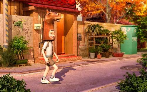
VERDICT: Didn’t like it. To be fair, the projection broke part way through this one, so it might have turned out good, but I wasn’t enjoying it at the time.
Ab Ovo
Interesting use of clay modelling, where the surface of the models was deliberately left ‘un-smoothed’ so it rippled, writhed moved and changed constantly. However, the storyline was pretty minimalist.
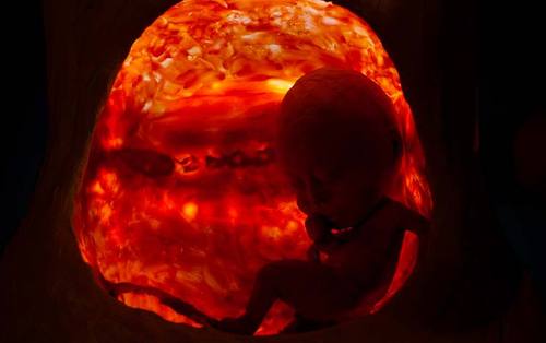
VERDICT: Interesting to look but it felt more like an experiment with a new technique rather than a fully-fledged ‘story’.
The Dewberry Empire
Lovely detailed watercolour backgrounds. Clever use of really sparse animation in opening credits, to set the scene. Animation style felt quite ‘manga-esque’ with low framerate and quite ‘cinematic’ movement and angles [rotoscoped?]
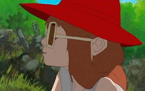
VERDICT: I quite liked this one. Backgrounds were great. Some of the dialogue was a bit difficult to understand --squeaky kids voices played really loud makes my ears bleed!
Plug & Play
Crude line art style. Strange surreal storyline. I’m not sure if it was a profound commentary on comtemporary morés, or just plain ‘weird shit’. Good use of humour, complemented by the use of OSX text-to-speech voices for the characters.
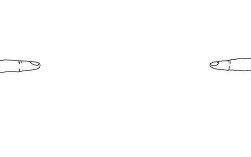
VERDICT: I liked it, but I’m not sure I got it.
First Light
Fairly traditional animation with a naive style to the characters. The cityscapes reminded me a bit of the opening to Futurama, although the overall style was very different. I didn’t find the character or storyline engaging at all.
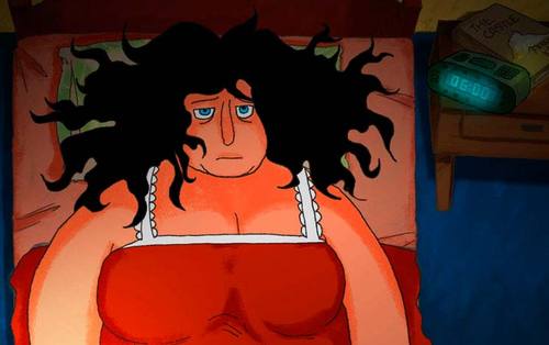
VERDICT: Dull [that could be a clever ‘light’-based pun, if I was being wittier than I am].
But Milk is Important
Lovely sets and models. Some nice use of unexpected ‘found’ materials for the props, for example a rectangle of denim for the blue lid of a milk carton. Characters were well-observed and had loads of personality. Also well-observed body language and subtle humour.
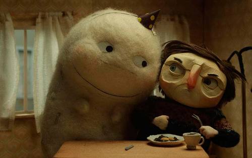
VERDICT: Probably my other favourite of the day.
When One Stops
Very minimalist line-arty, scratchy style. When the drawing is this basic you need an interesting storyline to back it up. Unfortunatley this didn’t have one.
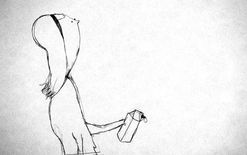
VERDICT: I was glad when it ‘stopped’ [I’m getting good at this punning lark now!]
Student 2 Showcase
The Odd Sound Out
Very ‘girly’ graphical style which reminded me of illustrations in women’s magazines. Not that I read them of course, but you see them lying around sometimes and simply have to catch up on the lates ‘shoe news’, daaahling! The idea for this one was quite nice, but I found the delivery a bit predictable and irritatingly repetitive [somewhat like the Pink Panther cartoons I used to find similarly annoying as a kid]. Also the main character’s signature noise was really annoying too.
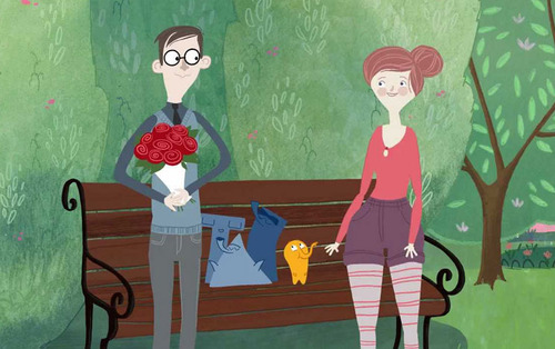
VERDICT: Nice idea, annoyingly executed.
Rabbit & Deer
For the first few minutes, I really hated this one. It seemed pretty tedious and uninteresting but, as the plot developed I found myself really enjoying it. The concept is great and the way the animation weaves a number of styles such as cutout, vector, stop-frame 3D modelling into the storyline is really cleverly done.
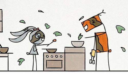
VERDICT: Stick with it. It’s really good.
The Shirley Temple
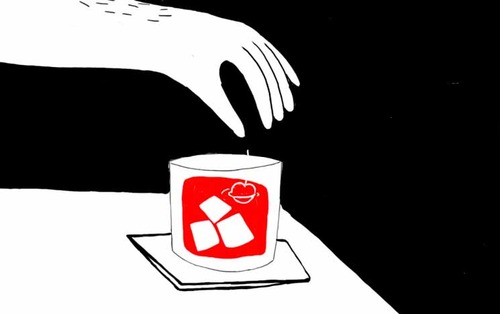
Quite abstract in appearance with a crude woodcut style. Lots of focus on transitions, abstract pattern and shape. Visually quite imaginatively done, but for some reason it just didn’t grab me. I think possibly because none of the characters had any personality, so you couldn’t identify with them.
VERDICT: Should have liked it more. Didn’t
The Magnificent Lion Boy
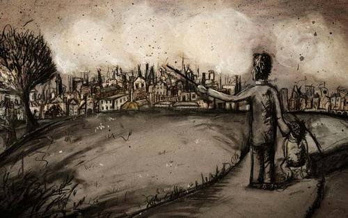
Interesting technique. It seemed to be done with pastels using a Muto-esque technique, where each frame was smeared and edited in place, without trying to hide the ‘workings’. However there was also some texture there, like it was drawn on hardboard or textured paper which, of course, would make it almost impossible to rub the pastels off. So I was left wondering “how did they do that?” The quality of drawing was slightly lacking, given the animator seemed to be going for a realistic look. The storyline was not bad, but not very original.
VERDICT: Quite enjoyable and an interesting technique.
SockSkewerStreet 8
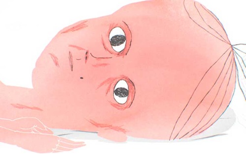
Painted background style. Drawing style very crude. I didn’t really get much sense of personality from the character and the storyline wasn’t up to much. Also, I hate socks and it was a story about socks!
VERDICT: meh!
Miss Todd
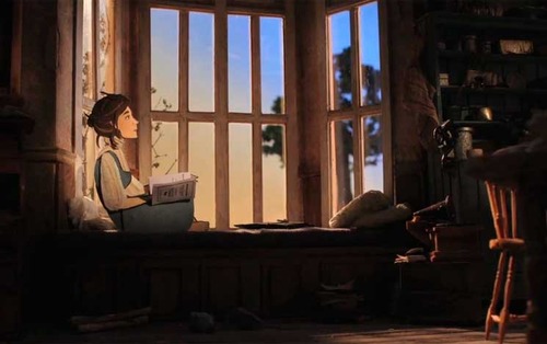
Interesting Paddington series style combination of cut-out puppet animation with real 3D models. Good use of the screen to give the sense of a wider landscape existing beyond the frame borders. Very ‘crafty’ feel to the construction of the characters. Apparently based on a true story, which was interesting enough, but a bit too “right on sisters!” for my tastes. Neither did I like the singing, as I hate musicals.
VERDICT: Visually inventive. Spoiled for me by being a pseudo-musical.
Memoria
More CGI. Very cinematic in feel with use of dramatic camera angles, lighting and editing. As with the previous CGI one, I felt the characters were a bit lifeless and the piece relied too much on computer-generated effects. The storyline was not bad.
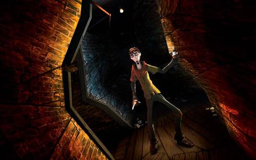
VERDICT: Too ‘computery’ for my tastes.
