One of the big changes that was trumpeted across the geek press, when Apple announced OSX Yosemite was Apple’s decision to do away with any hint of 'Skeuomorphism' in the look of the OS.
In a software setting, skeuomorphism means designing a software interface so it looks like a real world object. So, for example, a diary application might present an interface which looks like a leather bound ledger, or a calendar app might animate the turning pages of a calendar as you flip through its screens.
After the announcement of 'All-new Skeuo-free© Yosemite', the technology press were quick to leap open-mouthed to Apple’s hairy wang. For weeks you couldn’t move on the internet for scathing articles penned by [no doubt] Ident-I-Kit speccy, bearded, pointy-shoed hipsters, laughing up the sleeves of their lumberjack shirts at all the designers of decades past who’d dared to flirt with skeuomorphism.
On the face of it, the condescending hispters had a point. there have been some truly vomit-inducing skeuomorphic interfaces produced on Apple software over the past few years. The thing is, most of them were produced by Apple themselves. Yes, I’m thinking of you Address Book and you iCal [and several others down the years].
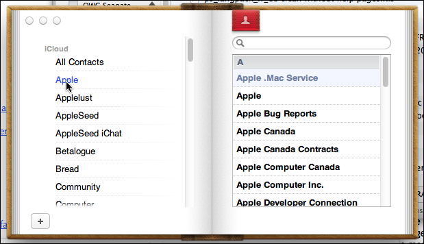
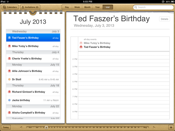
But, hold on a minute here. Let’s not chuck the baby out with the bathwater. Just because Apple are completely shite at skeuomorphism and have wisely given up trying to do it, does that mean that every other designer on the planet now has to abandon it also, lest they incur the wrath of the 'Kewl Journos'?
Doesn’t seem fair to me. But that’s what seems to be happening.
Slowly but surely the 'Flat Design' look [or as I call it "The Fisher Price for retarded Four Year-olds" look] is taking over. Everywhere you look skeuomorphism is out and flat is in --even if, in a lot of cases, the 'flat' designs are a hundred times worse than the supposedly 'bad' skeuomorphic designs they replaced.
Here is a classic example. [Sorry Yandex. I don’t mean to pick on you again, but this is just atrocious!]. Here, side-by-side are the old and new icons for Yandex.Disc [Yandex’s equivalent of Google Drive]. The old one is on the left [as if you couldn’t guess!]
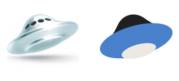
What in the name of Beelzebubb and all his legions was going through their minds when they made that decision? The original icon was gorgeous: a lovely 1950s style 'flying saucer' which evoked the notion that some advanced technology 'up there' was keeping your data safe --and all done in a charming retro way. The new icon looks like the plastic toggle on the end of the string I use to turn the light on in my bog!
But obviously the new icon is much better because "It’s Flat", dontcha know!
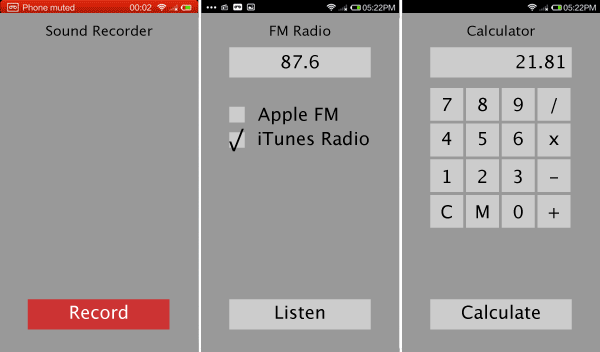
Here is another example: The Chinese phone maker Xiaomi produces its own version of the Android operating system called MIUI. Here taken from a reveiw on Ars Technica, which praised the hardware but harrumphed loudly about MIUI v4’s "…most insane tributes to skeuomorphism we have ever seen" are pictures of the Sound Recorder, FM Radio and Calculator apps:
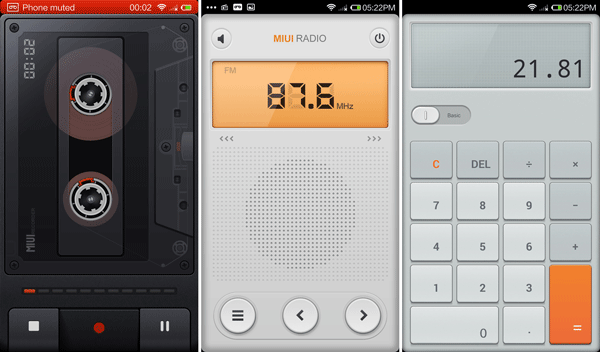
Now, I know I’ve been out of the design game for a while ["…those who can’t, teach…" and all thon], but I think those [well, specifically the Sound Recorder one] is a great interface. Apparently the play heads came out and the cassette reels turned, while you were recording. What’s wrong with that? It makes visual sense. It’s got a nice retro touch [which I’ll admit always ticks a few boxes with me: shows an awareness of things which happened prior to last week, which is often sadly lacking in the 'yoof' of today] and what’s more, its "fun!" [remember when design used to be allowed to be 'fun' everyone?]. I can imagine that app bringing a smile to your face every time you use it.
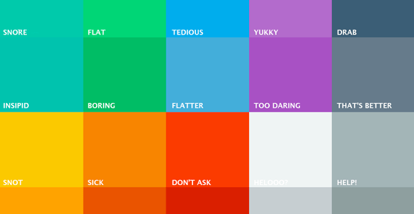
Good news though. Apple have spoken and now the entire design world must blindly follow. As Ars Technica were happy to point out in their review. For the forthcoming Version 6 of MIUI, Xiaomi have apparently 'wised up' and adopted the mandatory 'Flat Design' look.
I wasn’t able to find screenshots of how those three apps look in their new v6 guise, but I imagine it’s something like this:
