As the latest part of my ongoing campaign to reclaim much of the verbal diarrhoea that I’ve been spewing out onto the web over the past decade –in attempt to persuade people to pay me to do similar 'stuff' for them, I’ve been importing one of my old blogs, called Carry on Herman from Tumblr into Hugo, so I can host it myself. A task I look forward to immensely. [This being the third blog I’ve done this with.]
Anyway, to give myself a break from the interminable fixing up of mangled posts and tracking down broken links and images, I thought I’d do a bit of doodling today and work on the new logo I have planned for the blog.
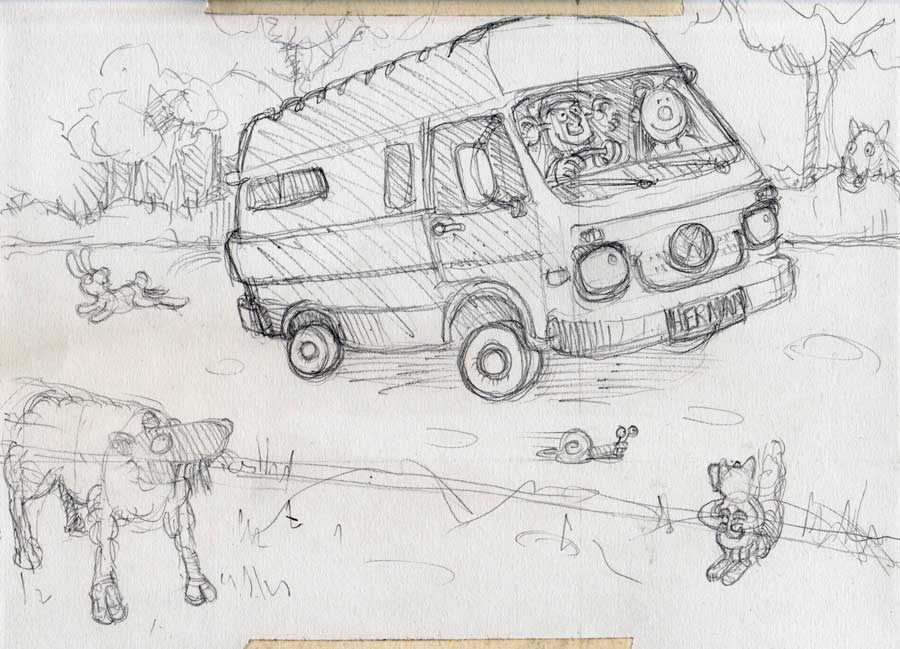
At this point I was planning to include the initial wee rough scribble of the idea, that I did on the bottom of one of my crosswords the other day. But, in a fit of insanity, I did a bit of housework yesterday and appear to have thrown that particular baby out with the other bin-liners full of bath-water. So, instead, here’s the second incarnation: the more finished pencil drawing I did, based on the orginal scrawl.
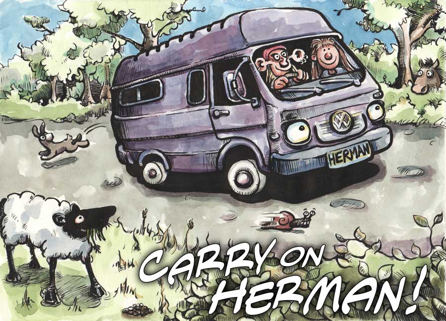
The aforementioned Carry on Herman blog is one wherein I record my cac-handed attempts to construct a self-build camper [Herman] from an old VW LT35 van. And where I also record some of the camping trips I go on. Hence the name of the blog and the subject matter of the new logo.
Should have mentioned that at the start, really!
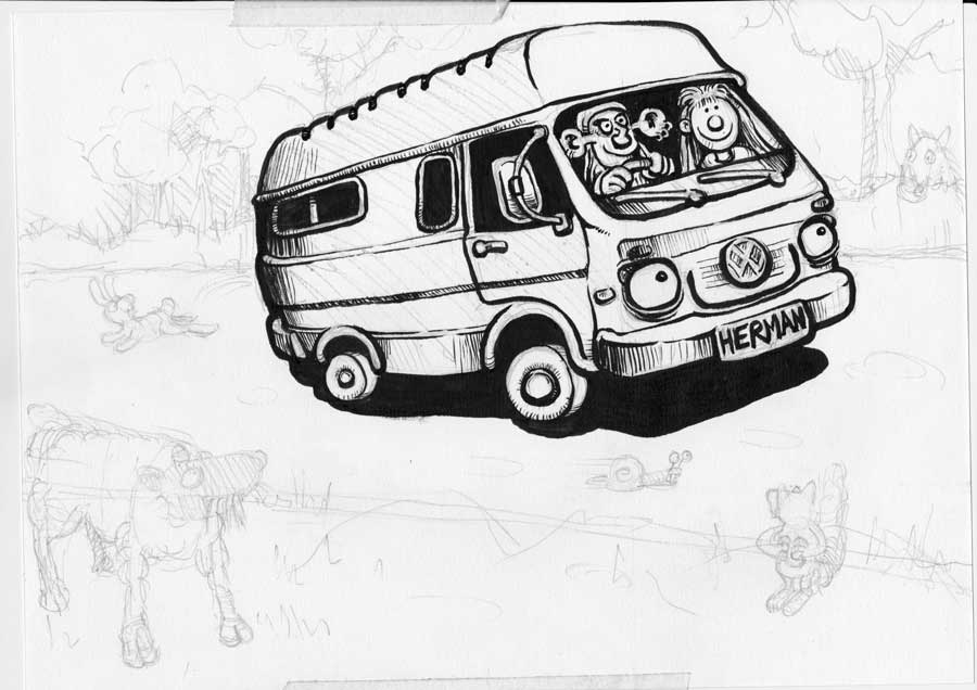
Anyway, once I had the pencil drawing pretty much how I wanted it, it was time to start inking up. This also provided the first outing 'in anger' for the Kolinsky Sable brush I treated myself to last week.
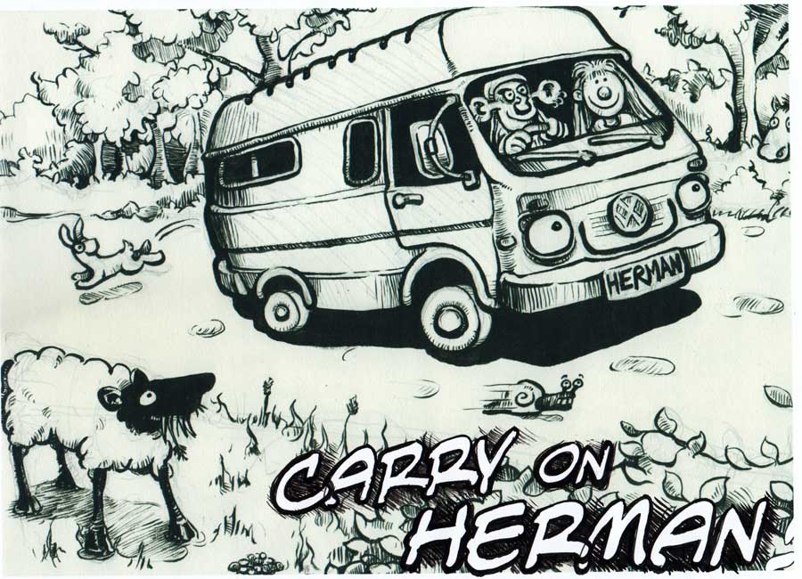
I started by inking in Herman himself [That’s me and the missus inside, by the way!]
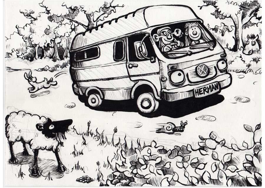
Then I started putting in the foreground and background.
Inking the central feature [ie. the van] in first allowed me to have a 'standard' weight of line to refer to when doing its surroundings so that [especially when doing the background] I could keep the lines a lot lighter, so things would [hopefully] not get too 'busy' looking.
I also decided to lose what was going to be a squirrel in the bottom righthand corner as that’s where the text is going to go. So, again, I thought it best not to get too 'busy' in that area. I substituted a suitably undistracting bunch of hedge.
Having got this far and with young Sammy the Squirrel having selflessly given up his chance for internet stardom, I thought it was time to have a poke about with the text layout. I wanted to keep it pretty small and use a comicky font, in keeping with the cartoony look of the logo.
I scanned what I’d done so far and brought it into Illustrator, where I eventually settled on a font called Antihero International BB. No idea where it came from. I suspect it may have been installed when I had a copy of Comic Life on the comp, a while back.
Anyway, I added the text and printed out the result. At this stage I wasn’t sure whether I was going to hand-render [via tracing] the text as part of the artwork itself –or complete the cartoon and then add the text later in Illustrator. After doing a bit of desultory shading and outlining round the text on my printout, I decided I’d go for Option B, as it would give me the chance to resize and reposition the lettering –and would also save me having to paint out parts of my ink drawing with white, where I wanted the text to go.
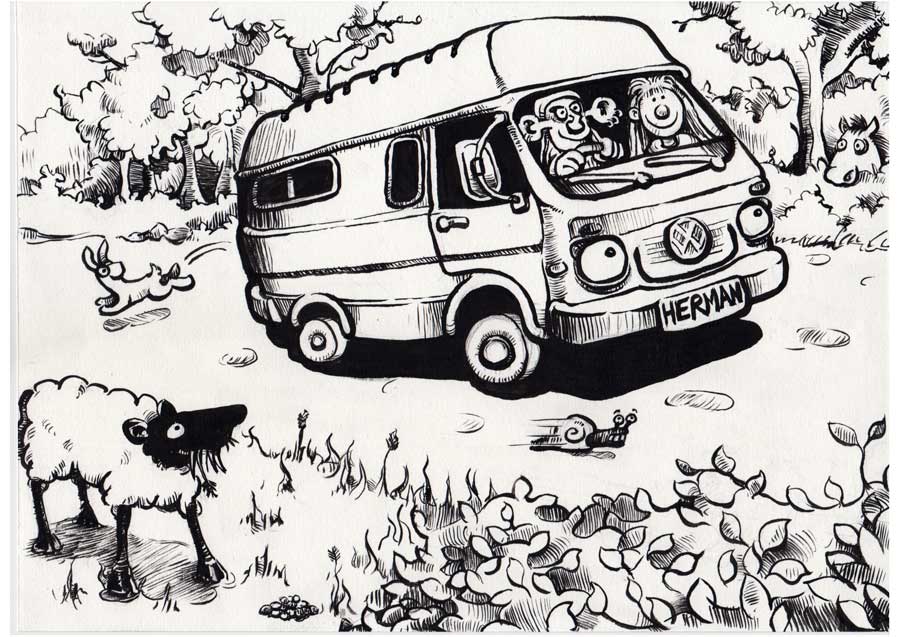
With matters typographical more or less decided, it was back to the original artwork again and time for a bit of cleaning up. I used a putty rubber to get rid of all the pencil lines.
Now it was out with the watercolours. A tense moment as, usually if a foot is going to be put wrong, this is where I’ll do it. I used one of my nice soft, floppy, squirrel hair brushes first and dolloped on the basic washes of colour.
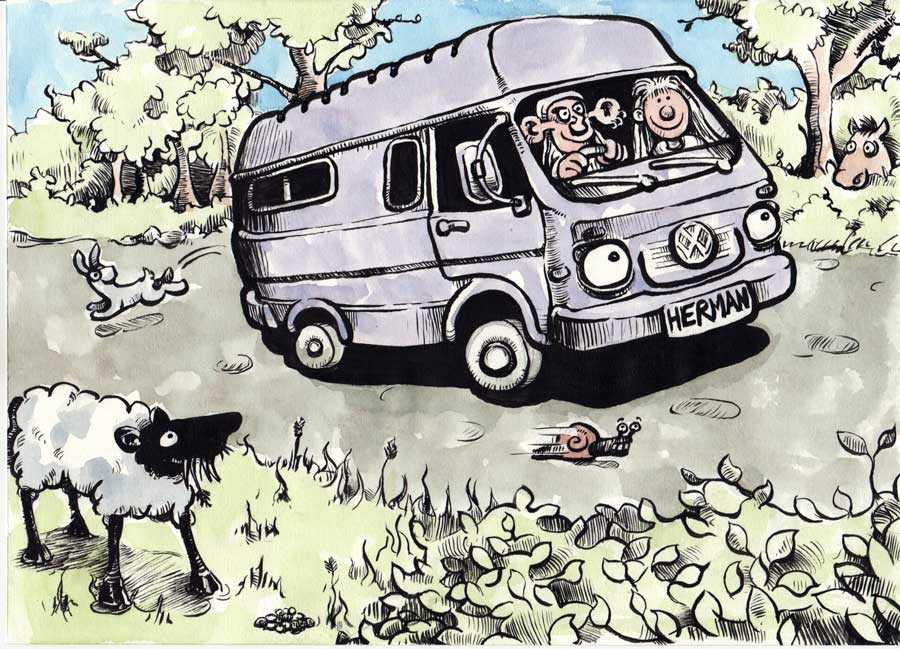
Once that lot had dried, I switched to a firmer 'standard' watercolour brush and added in more detail.
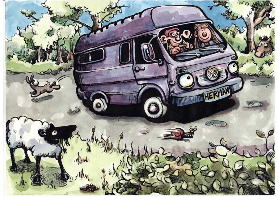
And finally, after twiddling my thumbs while that lot dried, it was time to scan the finished artwork and bring it into Illustrator again to add the text.
I pretty much stuck with my original font choice and sizes. But I broke the text into outlines and tweaked individual letters; resizing some, moving some slightly out of line, rotating some a fraction --–just to try and make it look a bit less 'machine-generated'. Then I duplicated the text layer and filled the underneath version with black, thickened its outline and added a bit of Gaussian Blur to give a bit of a pseudo-shadow underneath the top layer of text and make it sit up from the background a bit.
I’m still not 100% convinced about the text [So it’s a good job I did it this way, instead of drawing it directly onto the artwork!]. But I think I need to leave it til tomorrow now, so I can look at it with a fresh pair of eyes, as I’ve been staring at this thing all bloody day.