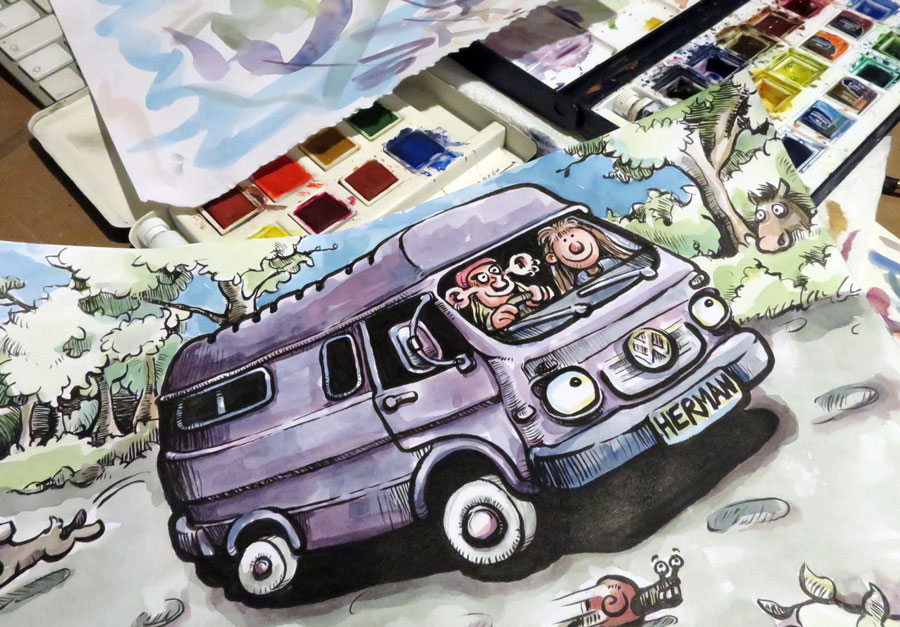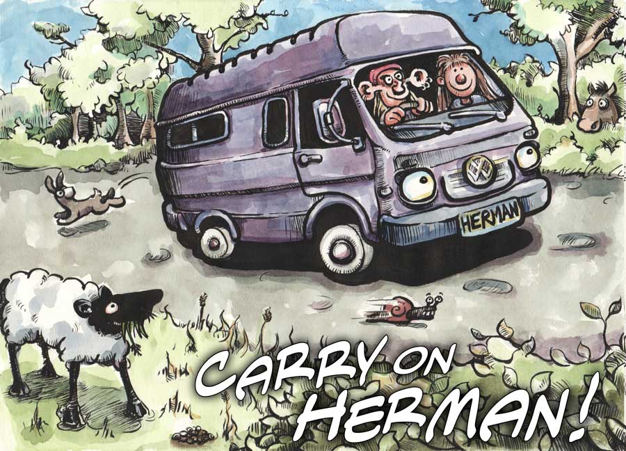
Those of you who read yesterday’s post on coming up with a new 'Carry on Herman' logo [ie. No-one on the entire planet] will remember that our hero retired dazed to his fart-sack for the night, still in two minds as to what format the text on the logo should take.
With bated breath, said non-existent readership will have stampeded back to this site today to find out what the outcome was…
Well, I can exclusively reveal that it was "Inconclusive". I’ve still not made my mind up.
However, last night, while cogitating on the work so far, I did spot a few minor details which [as is the way with such things] annoyed me more, the more I looked at them, until they took on the aspect of throbbing, fluorescent pustules on the face of my artwork. So, in order to be able to claim an advance of sorts today, I have at least fixed those up.
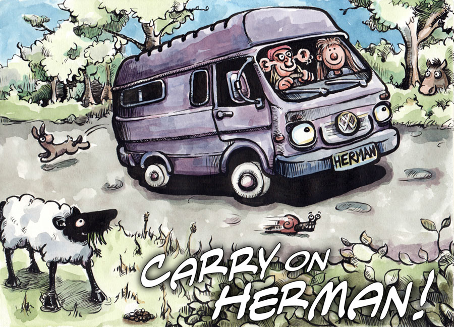
Here then, in one of Them’s Good Broth’s legendarily fantastic prize-less competitions, is your challenge. See if you can spot the five differences [although three of them are essentially the same difference, three times] between last night’s version and today’s 'all-new improved' incarnation:


Well, how did you do? If you managed to spot any differences between those two piccies then, unfortunately, you would seem to be suffering from the same form of OCD as myself –although I prefer to put a more positive spin on things by calling it "Impressively Thorough Attention to Detail".
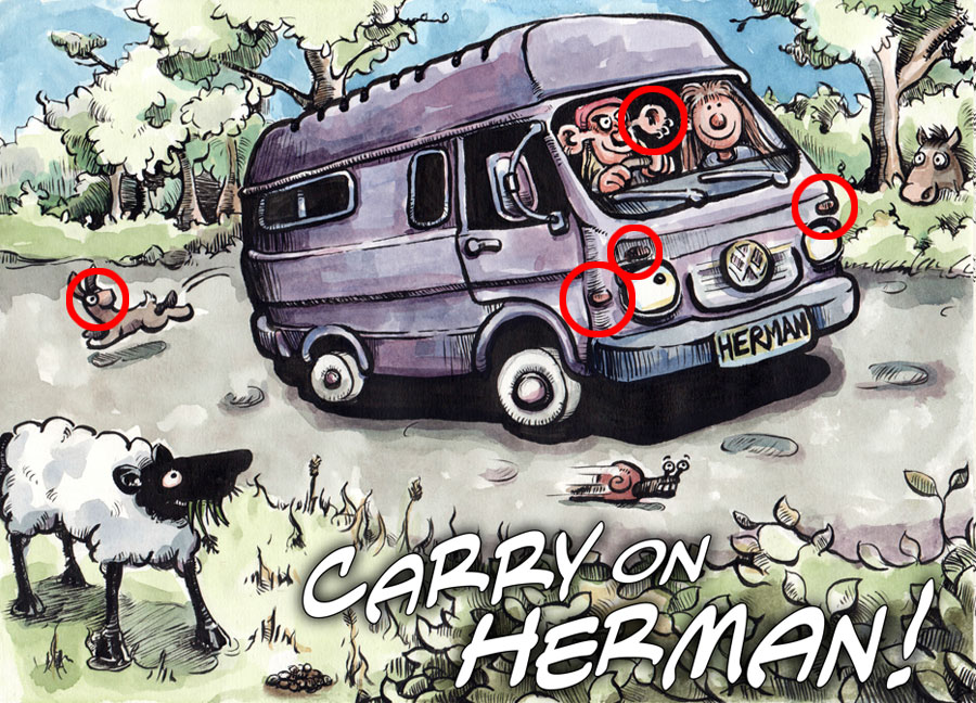
And the answers were:
-
The rabbit’s nose was too white, so I toned it down a bit.
-
Likewise, our handsome hero’s left ear was too bright and was likewise tamed.
-
I forgot to colour in Herman’s indicators which should, of course, have been orange [x3].

Well, now I’ve got those vital alterations under my belt, I can go back to pacing up and down the room, scratching my gormless chin, while wondering what to do about the text.
This one could run and run!
