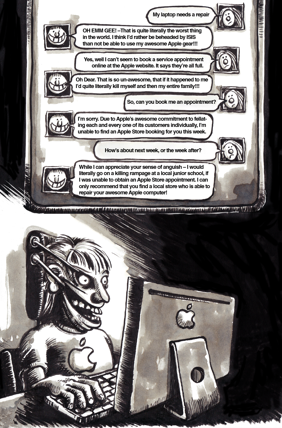
Today’s hilarious jape is based on my girlfriend’s experience of dealing with Apple’s online chat support the other day – after she’d been unable to book a 'Genius Bar' appointment online. Skillfully blending all that’s worst in Customer Service on both sides of the Atlantic, the people she 'chatted' to online combined an almost manic 'feeling your pain' Californian empathy, with a traditional British reluctance to help –which was really quite disturbing.
Finished piece first. Work-in-Progress report after:

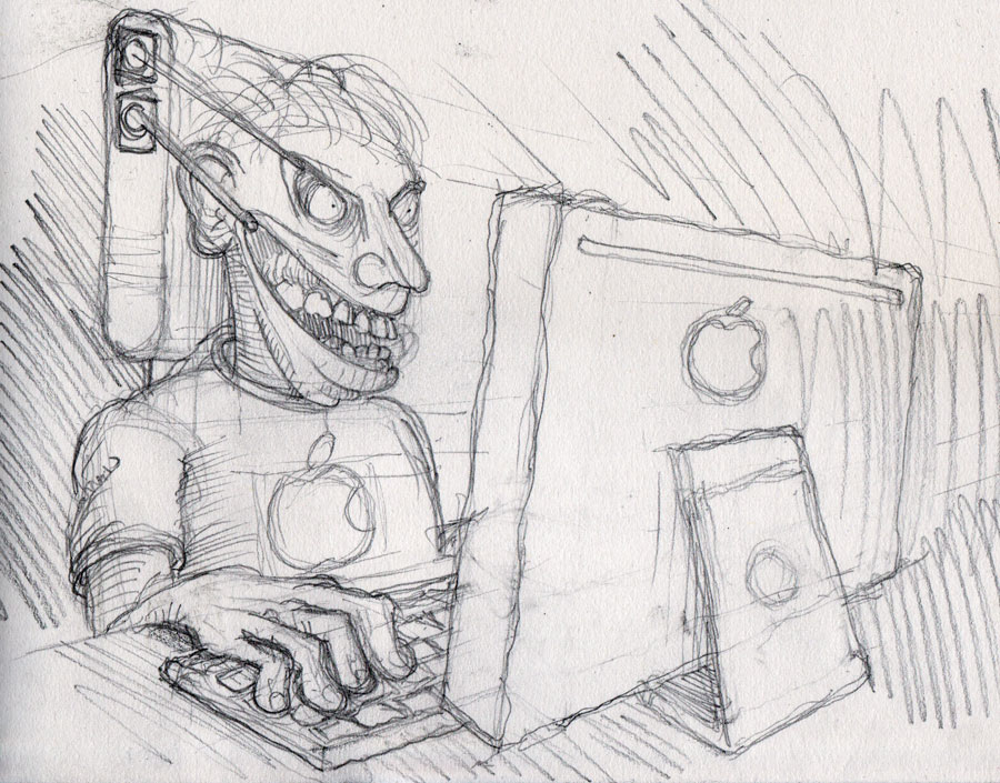
First off, the initial pencil sketch. I put a bit more shading into this than I usually would at this stage, because I wanted the light source to be coming mainly from the monitor screen. So needed to work out how that would look.
Then onto the initial inking.
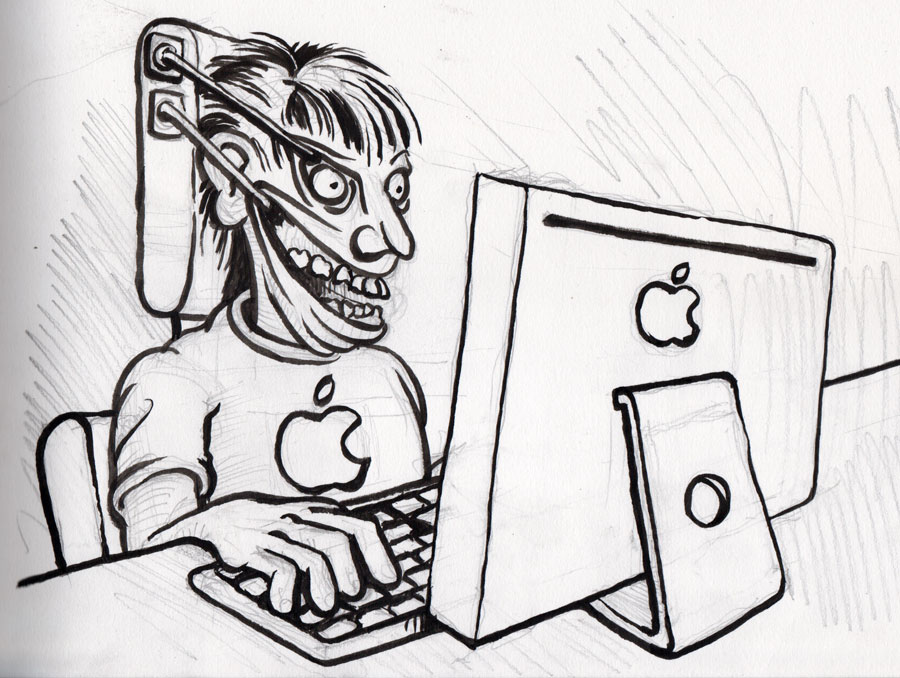
After that, I cleaned up the pencil lines with a putty rubber and put in the ink shading. It was at this stage that I opted to play my traditional "Completely Fucking up the Hand[s]" card. Might as well get it out of the way early!
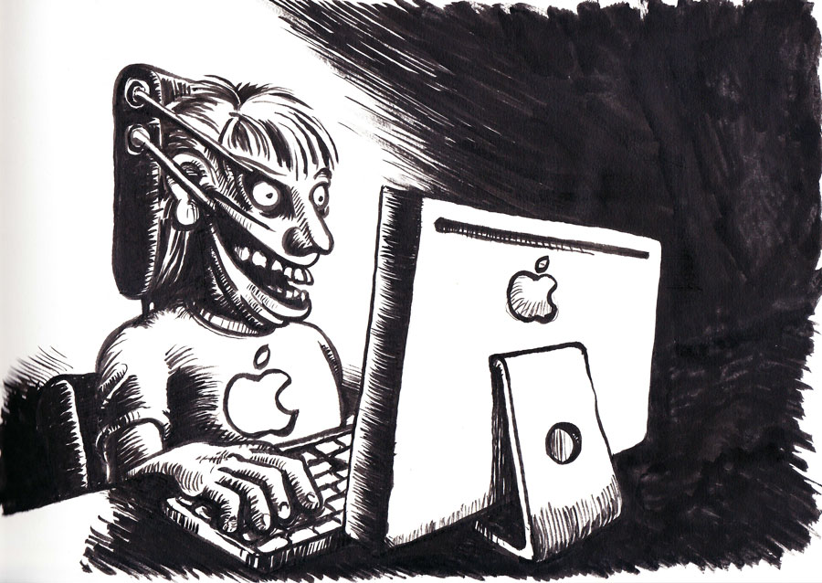
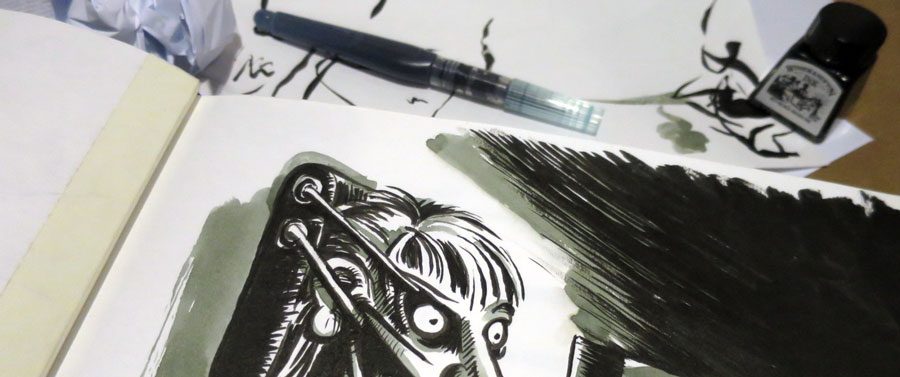
Next step was putting in some colour [well greyscale] washes. As with yesterday’s effort, I decided to use diluted drawing ink, in a water brush pen.
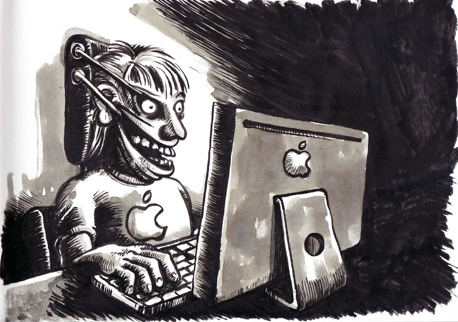
That was one half of the planned cartoon finished. The next stage was to draw up the chat conversation [or my satirical interpretation thereof], to complete the picture [literally!]
I typed up the dialogue and printed it out at various sizes until I found the biggest font size that would fit it all in one page. I then laid this underneath my sketchbook page and lightly traced the shapes of the blocks of text. That would give me something I could work around, whilst putting in the speech bubbles, icons and edges of the screen. These I then sketched in.
[Sorry about the crappy scan. Dunno what happened there!]
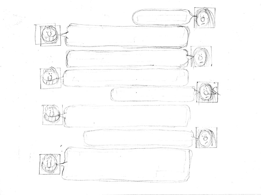
I then gave that its preliminary inking up and cleaned up the pencil lines.
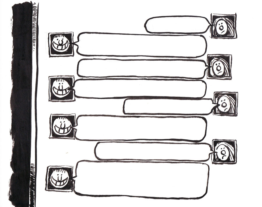
At this stage I was still minded [as had been my initial concept] to put the dialogue section to the right of the main character. But the more I thought about this the more I realised it would make for a pretty unwielldy cartoon, as it would be ridiculously wide. So I thought maybe the dialogue section should go above the main character. So I adapted my drawing accordingly, whilst also adding in the ink washes.
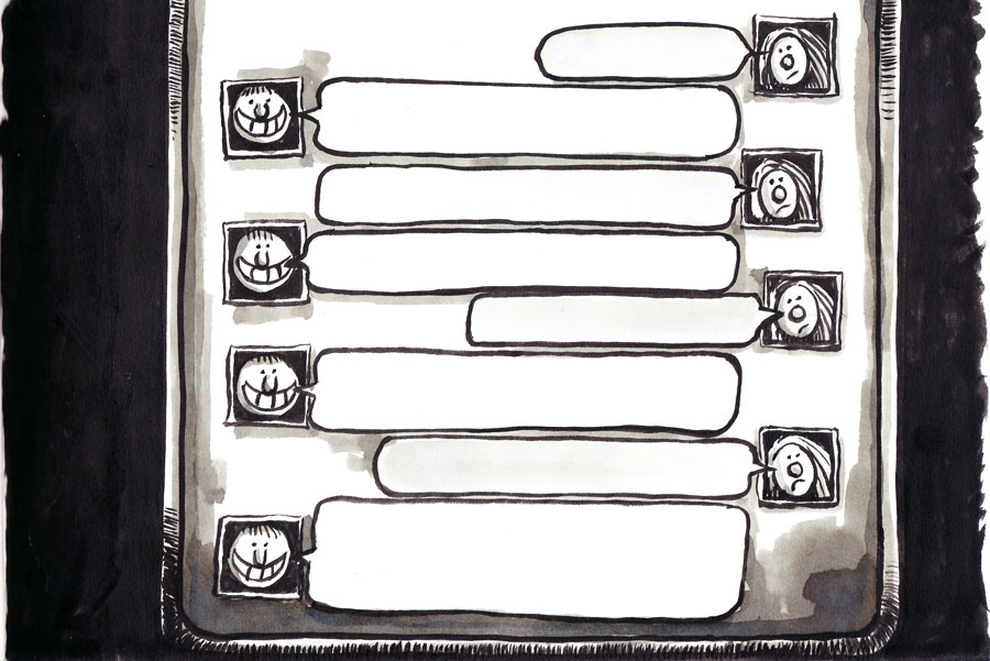
Then, I took my two finished scans into Photoshop, where I assembled them. Some of the areas of [intended] flat black were a bit patchy, so I applied an 'Exposure' adjustment layer and painted the black sections down an F-stop or two. I also did a wee bit of masking and scribbling with a fine white brush. These latter two, in order to make the join between the two sections a bit more seamless.
Finally I brought the composite image into Illustrator and added the text. I used good old Helvetica coz… well.. you can’t go wrong with Helvetica and, by adjusting the letter spacing down to -50, was able to up my original text size by two points, just to make it as legible as possible –bearing in mind the finished cartoon’s going to have to be reduced to 950px wide, to fit in a blog post without trashing the joint.
So, once again, the finished product:
