
Intro
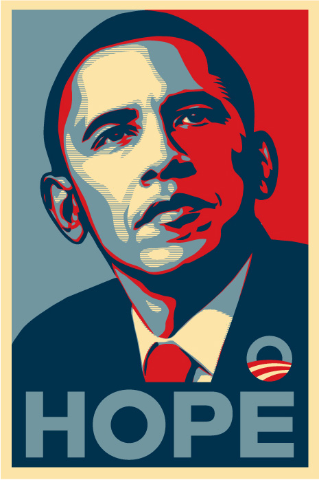
This tutorial post comes apropos of the fact that, the other day, the missus asked me to help her with creating custom patterned swatches in Illustrator. When I noseyed as to why she wanted to do this, she told me she was following an online tutorial for creating the effect used in that iconic Obama "Hope" poster.
Interest piqued, I took a quick look at the tutorial and saw that it was far more complicated than it needed to be; involving the aforementioned custom patterns, loads of intricate pen tool work and god knows what else.
No need for all that messing about, kids! In this tutorial I’m going to show you a simple [and fast!] method to recreate a pretty close approximation of the effect used on that Obama poster.
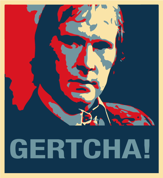
Here’s an example of what this tutorial will teach you to do.
DISCLAIMER: the original 'Hope' poster uses four colours, one of which [the lighter blue] appears both as a solid and in a halftone screen effect [the fine horizontal lines]. Because I’m making this tutorial a simplified version, I’m going to omit that half-toning effect and just use the four solid colours. Now, whilst that may offend the purists amongst you, I think that the end result still looks great and, anyway, that Obama poster has become so iconic that everyone will 'get' your cultural reference anyway.
One other benefit of my slightly simpler version is that you can literally churn these out in about five minutes, once you’ve practised the technique a couple of times.
Ready? Let’s go!
Equipment Needed
To follow along, you’ll need a copy of Adobe Photoshop and a copy of Adobe Illustrator. If you’re a FOSS kinda guy or gal, you can doubtless adapt this technique for The Gimp and Inkscape —but I’m sticking to what I know here.
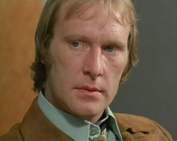
You’ll also need a photograph of your subject matter, to work from. Try and find one with a decent resolution [at least about 600px x 400px] and with a good range of tones from shadows to highlights.
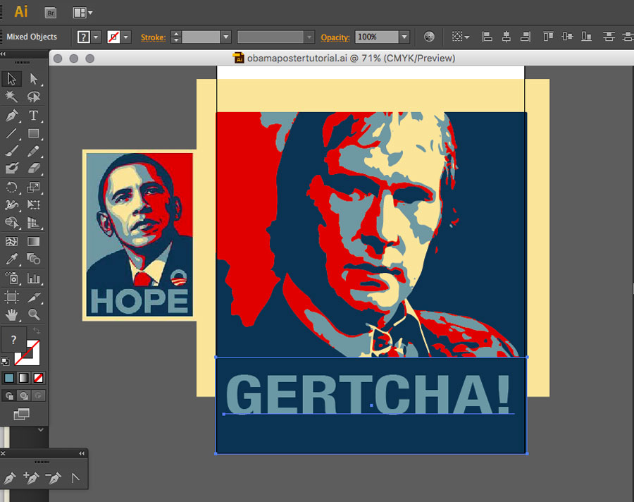
For reasons which are hysterically funny in our household, but which mean nothing to anyone else on the entire planet, I’m going to use an image of 'The Skirted Eggshell' himself, Dennis Waterman ie. "Terry McCann" from Minder.
Also, if you want to use the same colour selection as the original Obama poster, you’ll need a copy of that to use as a reference for colour sampling. It doesn’t have to be big, or detailed. So, here’s a tiny thumbnail you can use. [CTRL+Click or Right-CLick to download and save it]
First Stages: Photoshop
If you were lucky [or savvy!] enough to choose a Black & White image with a lovely range of tones and contrast to work from, you might even be able to miss this step and go straight onto the Illustrator section. But most of us mere mortals will have to pimp our original snaps a bit. So, we’ll do that in Photoshop.
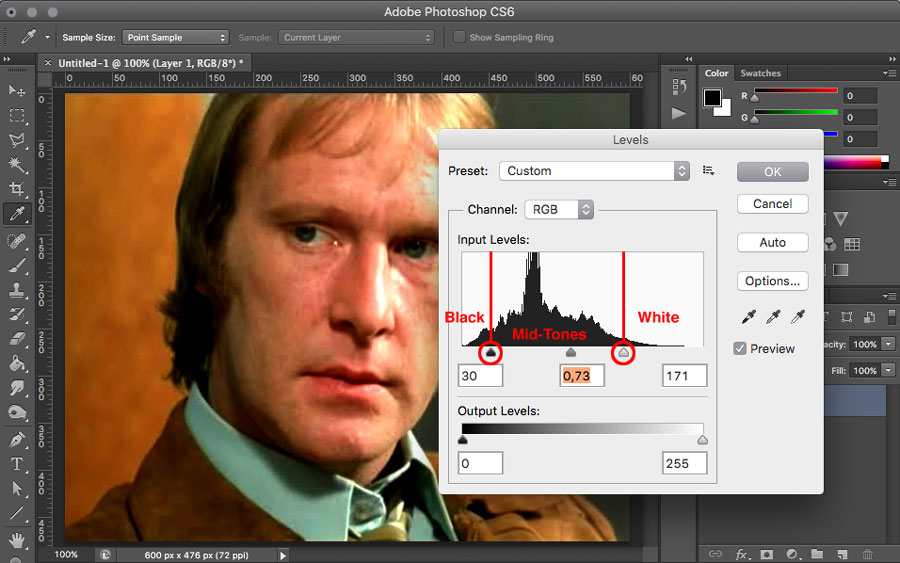
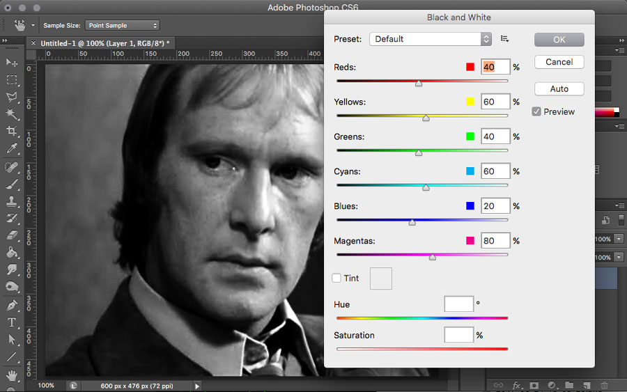
1: Adjust Levels
Open your chosen image in Photoshop and bring up the Levels panel with Image > Adjustments > Levels.
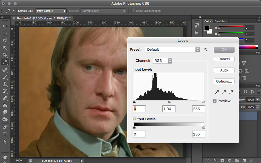
The Levels panel might look a bit complex but, in essence, all it does is allow you to make your image more punchy, by adjusting how its tones are displayed. The histogram in the middle shows you the range of tones actually present in your image. Everything to the left of the leftmost upwards pointing arrow immediately beneath it will be displayed as black. Everything to the right of the rightmost upwards pointing arrow immediately beneath it will be displayed as white.
If your image is very washed out to start with [as mine is in the photo above] then neither end of the histogram will reach as far as the arrows. This means that there are no proper blacks or whites in the image --only a range of mid-tones.
You need to move the left and right arrows in towards the centre so that they at least reach [and for the purposes of this tutorial] overlap the ends of the histogram. As you do so, you’ll see more of your image turning black/dark or white/light. You’re aiming to get the image as punchy looking as possible, with a good balance of black and white tones. [You can also move the central arrow, to adjust the overall 'balance' between these two extremes].
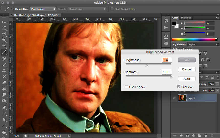
2: Adjust Brightness and Contrast
After adjusting the Levels to make your image as punchy as possible, it’s time to give the Brightness and Contrast a twiddle, to further enhance the effect. The Brightness & Contrast panel is found under Image > Adjustments > Brightness/Contrast.
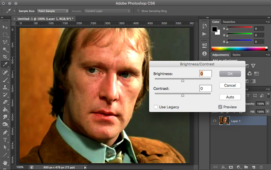
As before, it’s a question of 'season to taste'. You’re trying to further increase the contrast of the image, so that, when you eventually reduce the number of colours to 'posterise' it, you’ll get a nice balance across the tonal range. Usually it will suffice to bump the Contrast up full and then give the Brightness a wee nudge either way, just to fine tune things.
3: Save Black and White Version
Now your image is nice and contrasty, convert it to Black & White and save it. Newer versions of Photoshop have a specific Black & White adjustment, under Image > Adjustments > Black & White. If you’re using an older version [or you just want to be contrary], you can use Image > Adjustments > Desaturate to achieve almost the same effect.
All done and saved? Good. you’re done with Photoshop now. So you can quit that and fire up Illustrator instead.
Second Stages: Illustrator
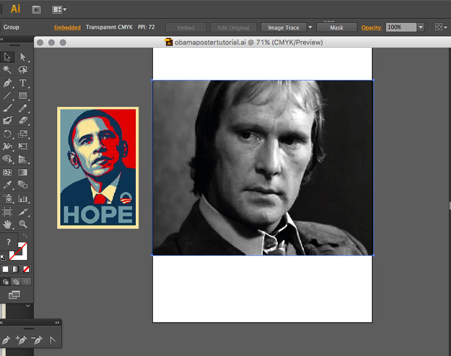
1: Place your Image [and the reference thumbnail]
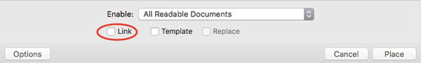
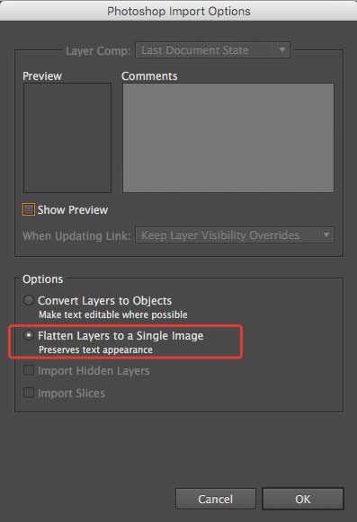
Create a new document in Illustrator and then use File > Place to place both the Photoshop document you were working on before and also the Obama poster reference image, into your document. Two things to look out for when placing the images:
i: Make sure the Link option is unticked, so you’re actually embedding your photograph and not just linking to it
ii: Make sure Flatten layers to a Single Image... is chosen, otherwise you’ll have problems with the Trace tool, later.
When you’ve placed the two images, move the Obama poster thumbnail off to the side, as it’s not going to be part of the finished piece. It’s only there to sample colours from.
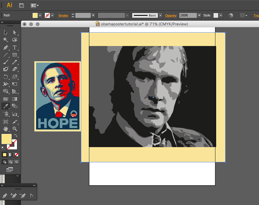
2: Posterise your Image
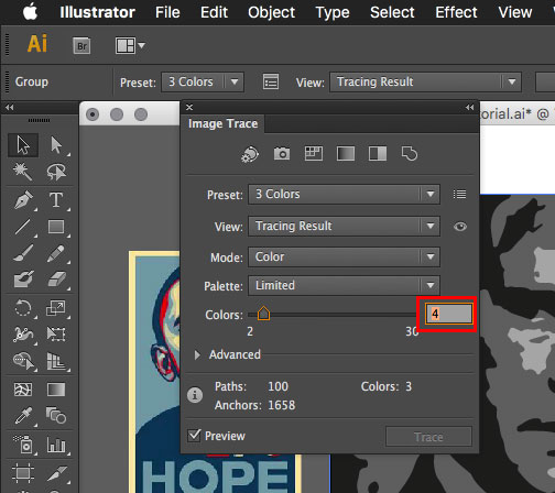
Make sure your main image is selected and then use the Trace tool, found under Object > Image Trace > Make to convert it to vector shapes. Don’t worry that, at this stage it looks like crap. those are just the default settings.
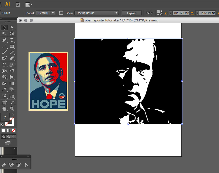
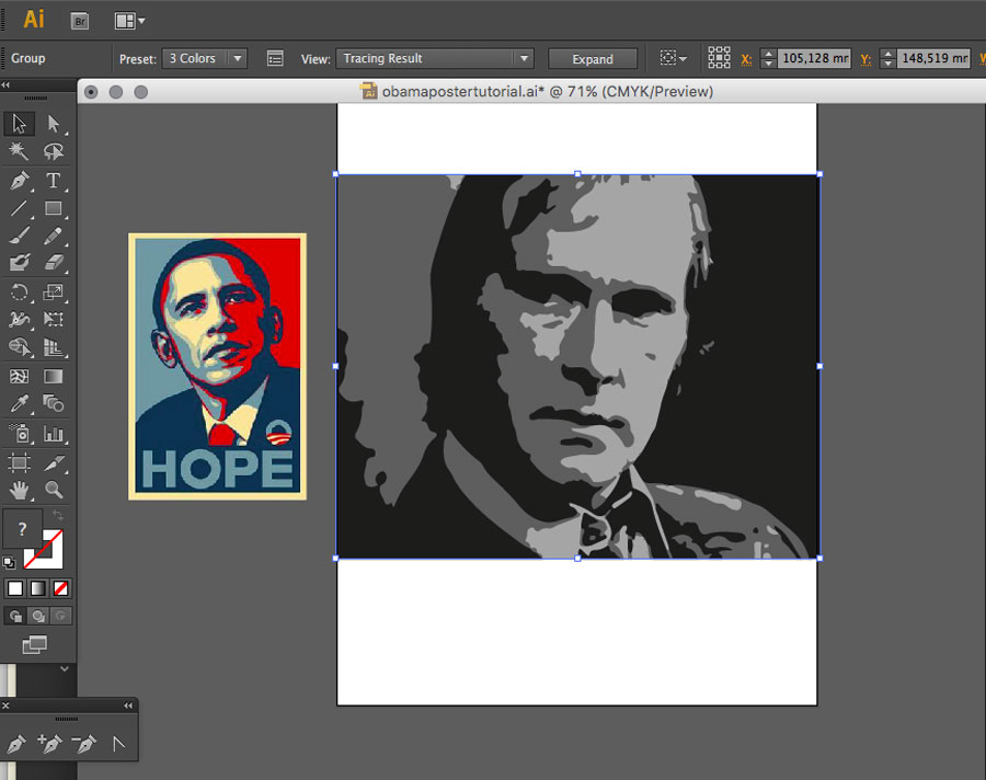
After the Image Trace has done its thing, you’ll see the Image Trace options appear above the document window. Unless you’ve been image tracing before, the Preset option will most likely have er… 'defaulted' to Default. Pop that menu up and choose 3 colours instead and Image Trace will do its thing again. This time producing a better result.
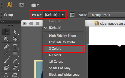
Now. That’s looking better. But the smart boys and girls amongst you will be thinking "Hang on a minute! The Obama poster uses four colours, not three!"
You’re absolutely correct. But, since there’s no '4 Colour' preset, we’ll just use the '3 Colour' one as a starting point and then add another colour. [If you’re planning to do a load of these, you might want to create your own '4 Colour' preset and use the nano-second saved using that each time, to learn the violin, or ukelele]
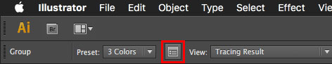
Click the wee palette icon to the right of the preset name and, in the menu that pops up, change Colours to 4.
Once again, Image Trace will do its thing and, this time, you’ll end up with a 4-Colour posterised version of your image.
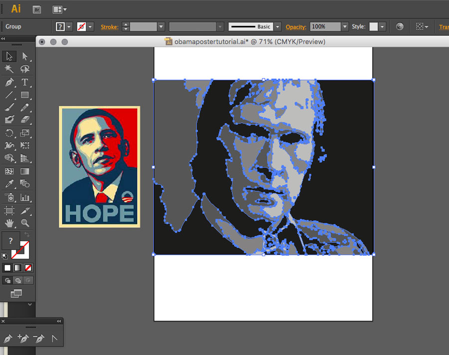
At this stage, the traced image will be a single non-editable object. So in order to make it editable, you need to Expand it. The Expand button is to the righthand side of the Image Trace options panel.
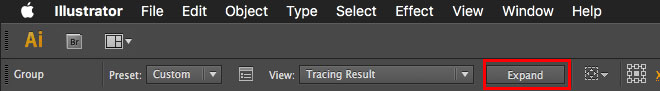
Now you have a four colour posterised version of your image, with each component shape ready to be edited
3: Add Background Colour
It’s nearly time for the fun stuff. But first, one more bit of foundation work. You need to put in the background colour for your poster, as this is also used as the light tone in the image.
Using the rectangle tool, drag out a rectangle, with a fill but no outline, over the top of your image, so that it covers the whole image, with a bit of overlap.
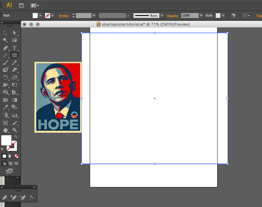
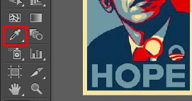
Leave the rectangle shape selected and then click on the Eyedropper tool in the tools panel. Using the Eyedropper tool, click on an area of background colour in the Obama poster reference image, to sample it. His shirt collar is a good option.
Because you left the background rectangle selected, it will automatically change to the sampled colour.
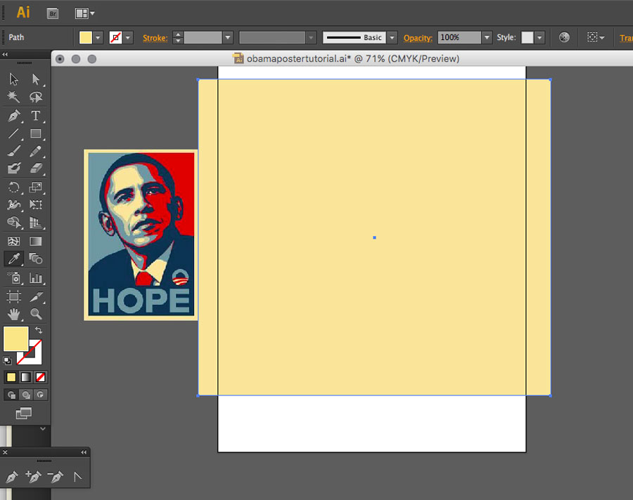
Now send the rectangle to the back of your image with Object > Arrange > Send to Back
4: Convert Image Colours
Now we’re ready for the fun bits!
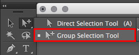
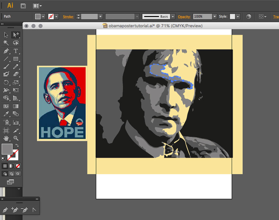
In order to select individual shapes within the posterised image, you need to use the Group Selection Tool. That’s the white arrow, with the plus sign beside it, in the tools panel. It lives underneath the Direct Selection Tool, or 'normal' white arrow. So you’ll have to pop that up to get at it.
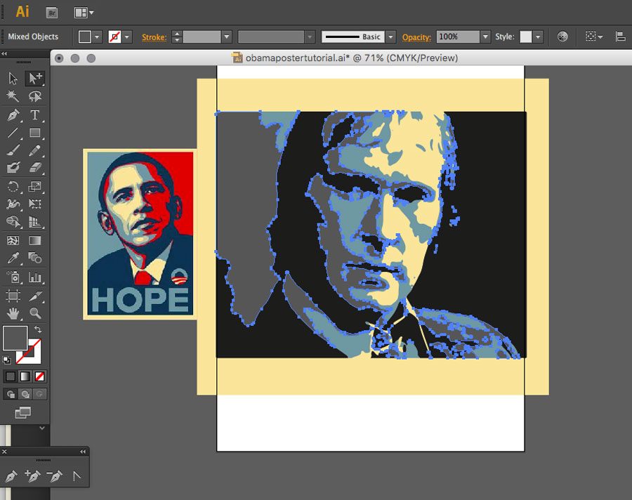
With the Group Selection Tool, click on an area of your image which has the lightest of the four grey tones.
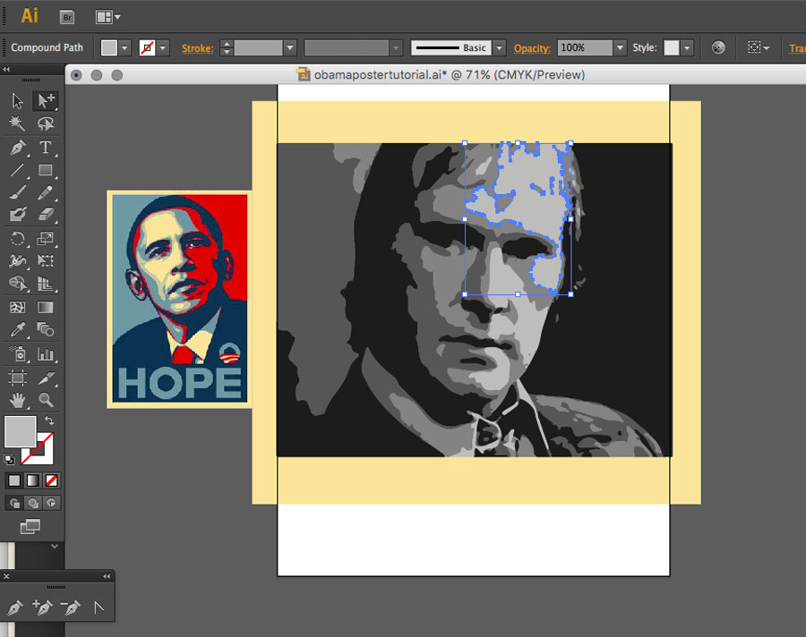
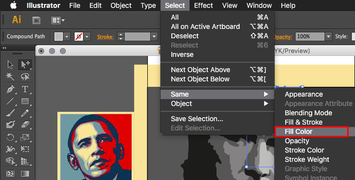
Now choose Select > Same > Fill Colour, to automagically select all the other similarly coloured areas in your image
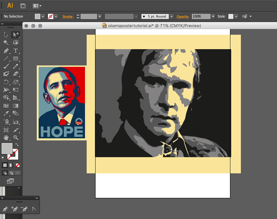
As the lightest tones in the poster are the same as the background colour, just hit your Delete key now and get rid of these selected areas.
OK. Now we’re cooking on gas!
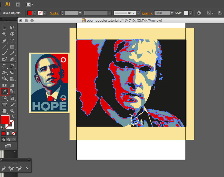
Next up, select an area in the image corresponding to the next lightest tone.
As before, choose Select > Same > Fill Colour, to automagically select all the other areas of that colour.
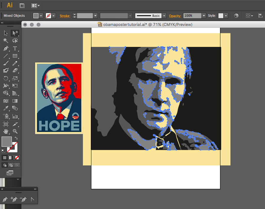
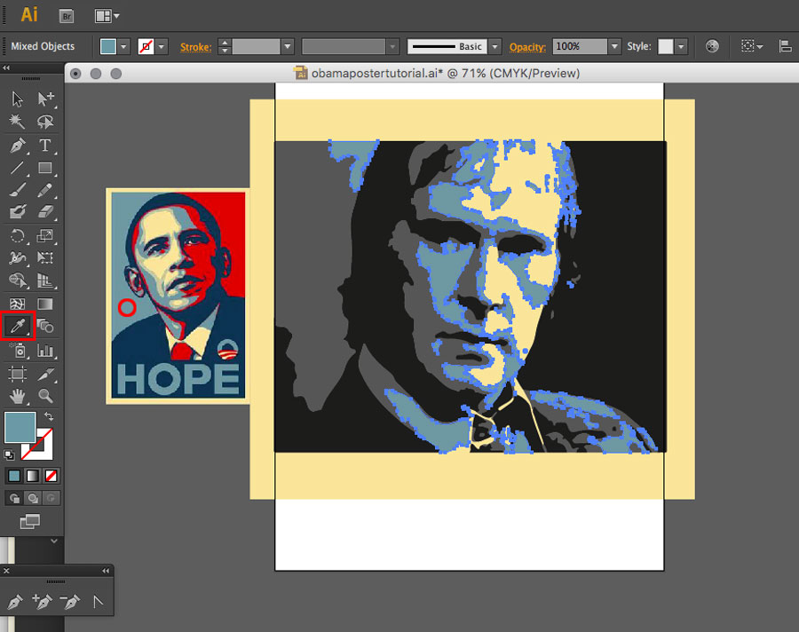
Leave those areas selected and then choose the Eyedropper tool again.
With the Eyedropper tool, click an area of the light blue on the Obama reference poster, to sample it. As with the Background, because you left the light tone areas selected on your main image, they will automatically pick up the new colour, as soon as you sample it.
You can probably take it from here yourself. But, just for the sake of completeness, I’ll walk through the rest of it.
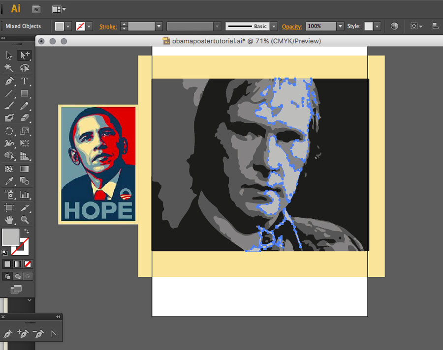
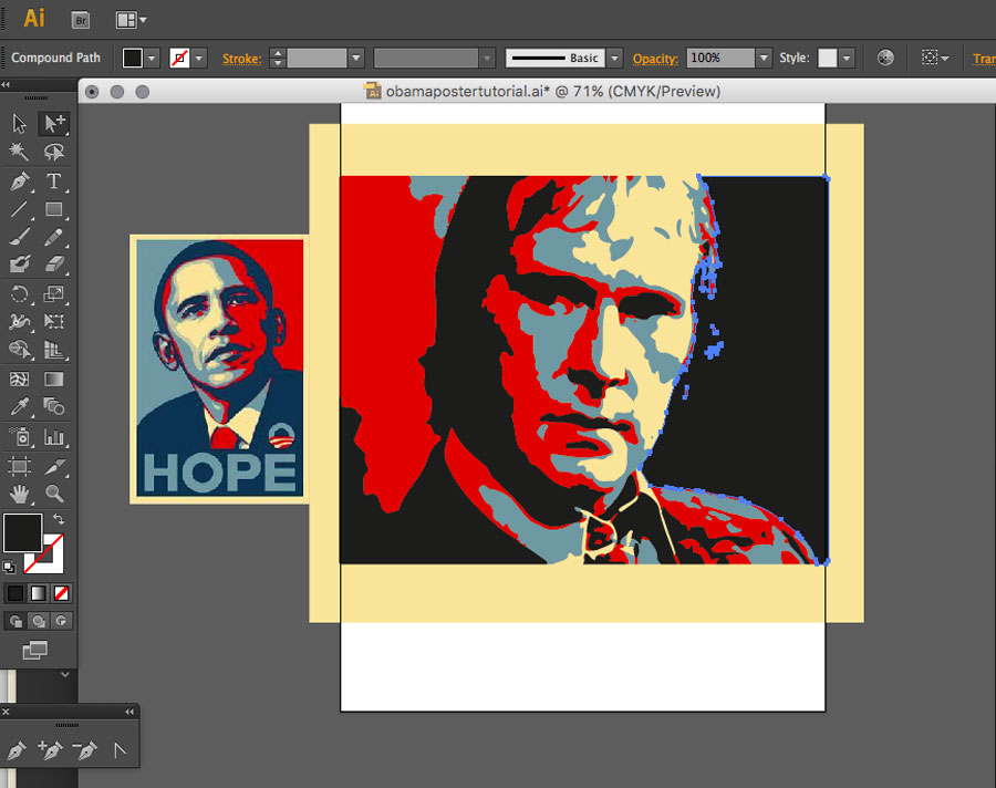
Don’t forget to switch back to your Group Selection Tool and now select an area of the third lightest tone [or 'second darkest', if you prefer].
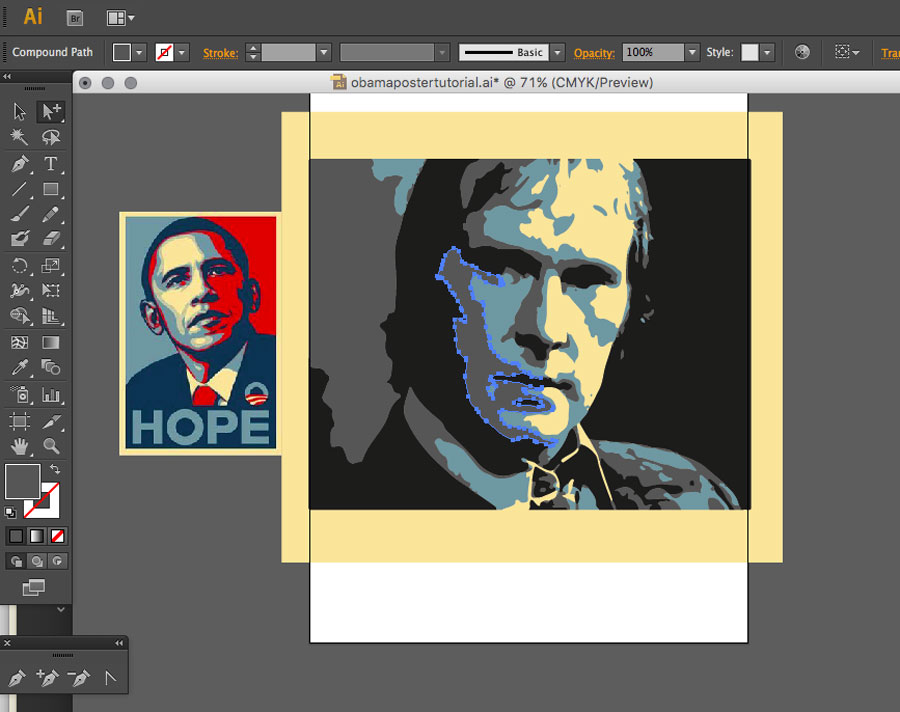
And again, choose Select > Same > Fill Colour, to automagically select all the other areas of that colour.
Leave those areas selected and then choose the Eyedropper tool again.
This time click on an area of the red colour on the Obama reference poster, to sample that. As before, because you left the corresponding areas selected on your main image, they will automatically pick up the new colour, as soon as you sample it.
Nearly there!
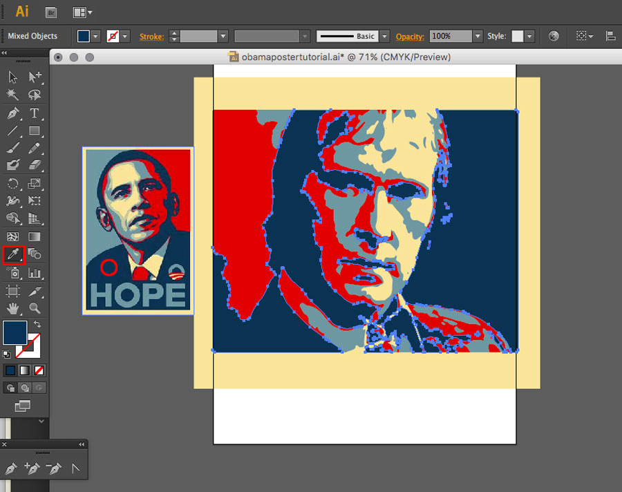
Now switch back to your Group Selection Tool again and select an area of the darkest tone.
And again, choose Select > Same > Fill Colour, to automagically select all the other areas of that colour.
Yes, I am copy/pasting this. What do you want at this stage?… Originality?

Leave those areas selected and then choose the Eyedropper tool again.
Now select an area of the darkest colour on the Obama reference poster. As before, because you left the areas selected on your main image, they will automatically pick up the new colour, as soon as you sample it.
And that’s pretty much it, as far as creating the Obama poster styled artwork. It may look quite a process, when you read through the tutorial —and it sure felt like a lot, when I had to screengrab it all and write it up! But, once you’ve run through it a couple of times, you’ll find you can churn these out in about five minutes a piece.
If you’re not bored reading yet, here’s a couple more steps. Just to tidy up the loose ends.
5: Add a Slogan
No parody of the Obama 'Hope' poster is complete without a side-splittingly witty slogan. So I’ve adorned mine with a suitably guttural cockney grunt from 'Tel'.
As you can see, the dark colour is used for the background behind the text and the light blue colour for the text itself.
Sample the colour for those from your newly created image, rather than from the reference image, so you can be sure they’re exactly the same. Because the reference image has been [wrongly!] saved as a jpg there are slight variations in what are supposed to be areas of flat colour. These make it unlikely you’d be able to pick precisely the same colour from the reference image, twice in a row.
As regards the font, I’m not sure what the original poster uses. But I’ve used Helvetica Neue Condensed Bold here, with a slight tweak to the height and width and I think it looks pretty close.
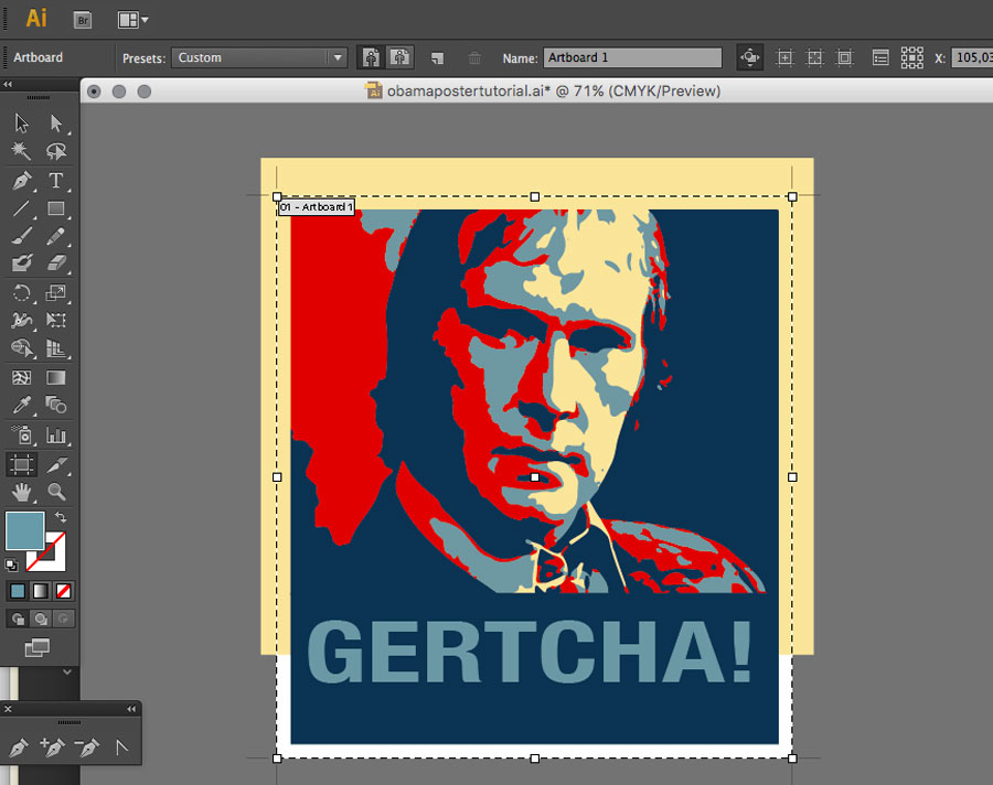
6: Trim Artboard
If you’re the kind of organised person I think you are, you probably made your Illustrator document the exact size you wanted and, previously, chose your subject photograph with similar precision. So you’re all done and dusted now.
Myself. I am descended from a fine lineage of people, whose approach to life is best summed up as "making it up as you go along". So I usually end up with my artwork hanging off the edge of my Artboard, or a completely different shape. In these cases, a quick trip to File > Document Setup... > Edit Artboards is usually required, in order to cut my metaphorical coat to fit my metaphorical cloth.
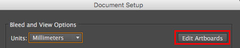
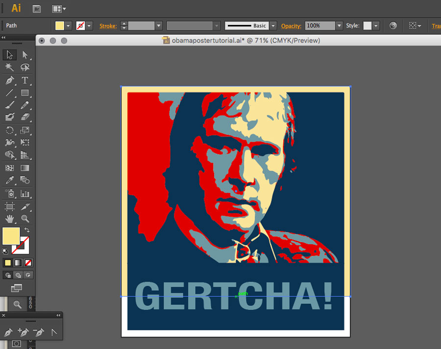
If you haven’t done so already, this is also a good time to get rid of the Obama poster reference image which, in what must be some kind of political metaphor, has now outlived its usefulness and must be consigned to the dustbin of history.
Once you’ve resized your Artboard accordingly, hit Esc to return to 'normal' mode. You might [like I had to] also have to adjust the sizing of your background colour rectangle to conform to your new Artboard dimensions.
And there you have it. You can now use Illustrator’s File > Save for Web function to save out copies of your masterpiece, to share with an eagerly waiting world. png or gif are the best formats to save flat colour images like this.
Any questions, ask away in the comments!