A selection of finished artwork, produced during my time as graphic designer for the UK arm of Adacel Multimedia PTY. My work mainly involved designing interfaces for their business simulation software products and liaising with their programming team in Melbourne Australia to get the things built. A lot of it looks cringeingly dated now ['Bevel & Emboss' and 'Drop Shadow', anyone?] but, at the time it was pretty adventurous stuff –especially since, up to then, Adacel’s business simulation software was very blue, very texty and very corporate looking.
Anyway, once they got over their "but business software can’t looklike that!" shock, the suits seemed to like it. I’ve also included a few advertisingand promotional bits’n’bobs I did during my time there, as well.
Risk in Action
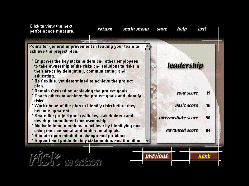
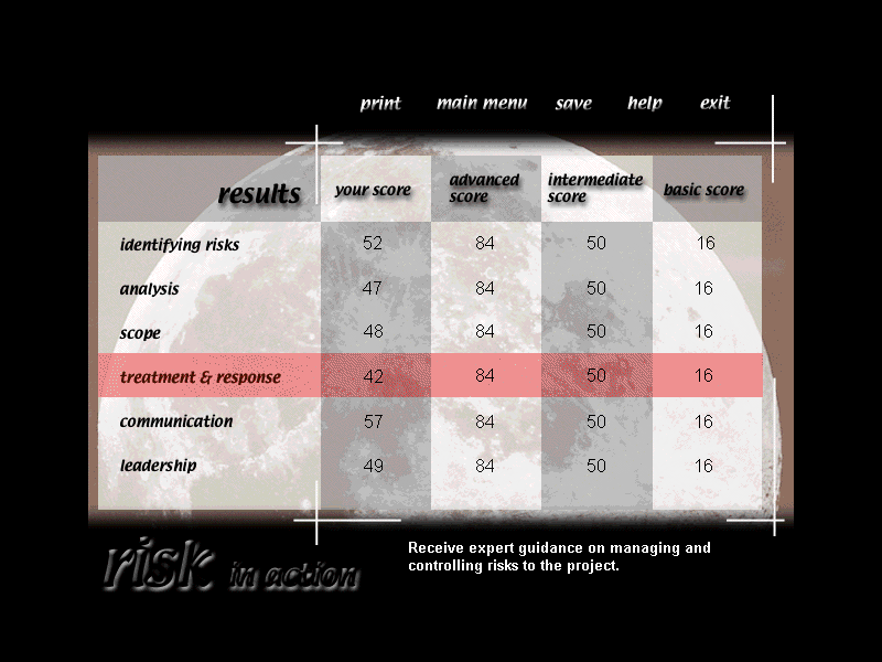
The first simulation software I designed the interface for, from the ground up. Along with my two co-workers [who wrote the scripts for the scenarios] we designed a simulation about an old-fashioned prestigious department store called "Powell & Davis" [named after the two streets in Melbourne where we lived and worked, while on a two month working visit to Australia].
In our story-line Powell & Davis is bought out by a new, thrusting young owner and users of the sim take on the role of Risk Manager, overseeing said new owner’s plans for modernisation of the business, in the face of opposition from traditionalists in the boardroom.
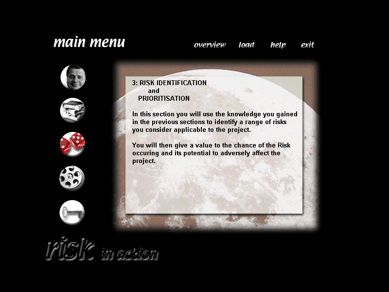
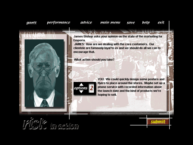
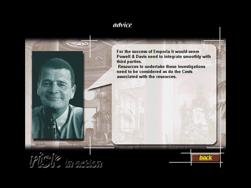
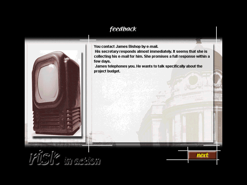
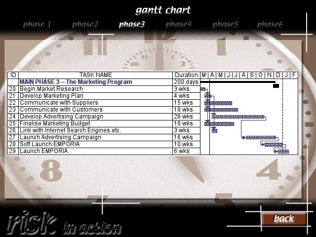
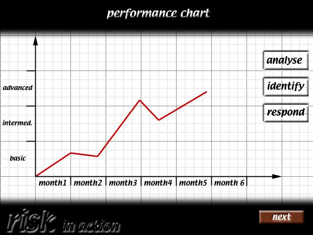
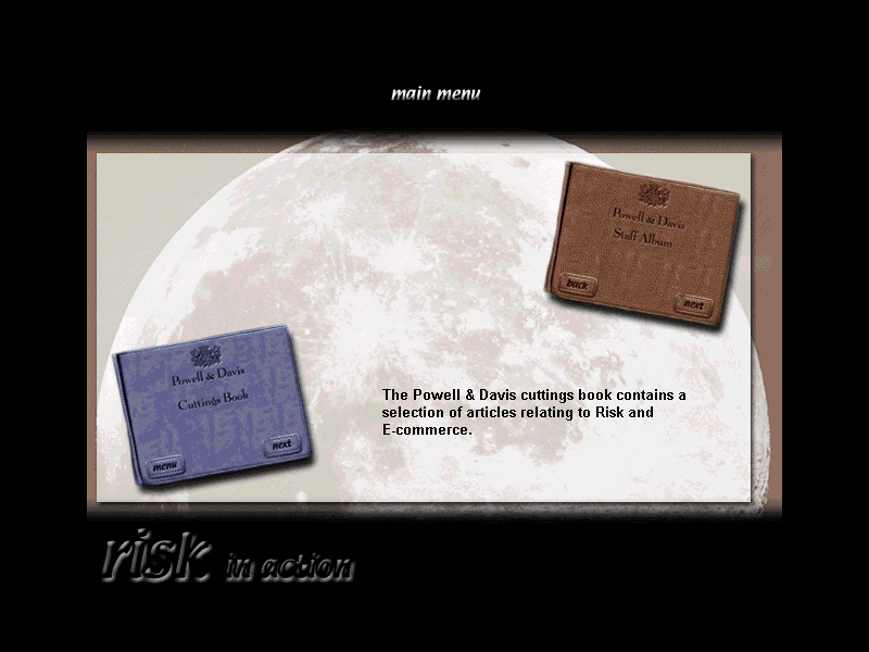
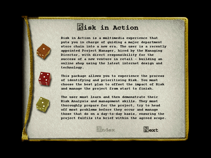
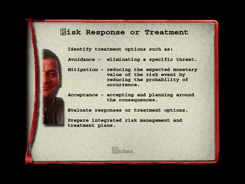
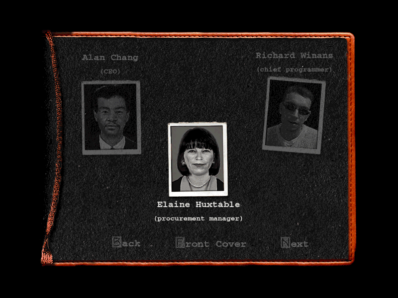
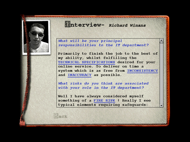
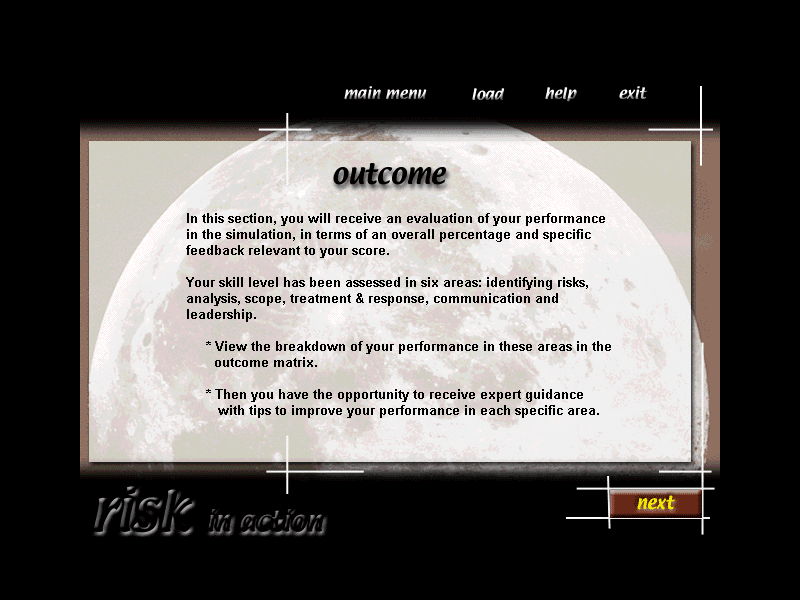
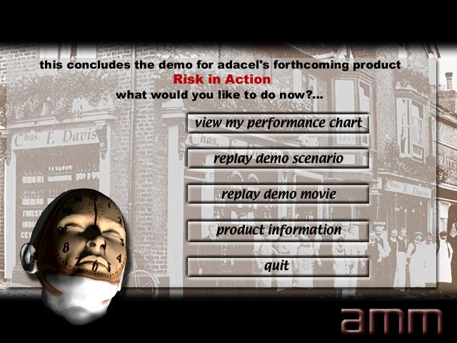
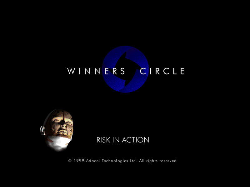
I designed the interface to have a bit of a retro feel, to reflect Powell & Davis’s long pedigree and hint at the 'living in the past' attitudes that the new risk manager would have to overcome.
Below are a selection of screens used in the interface:
Workplace Communication in Action
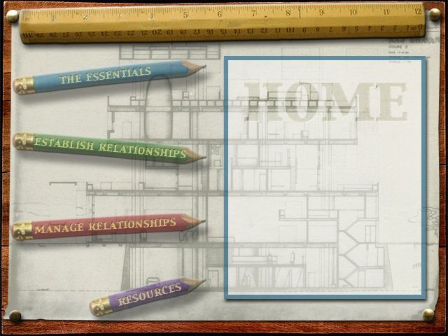
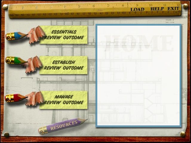
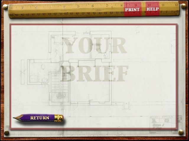
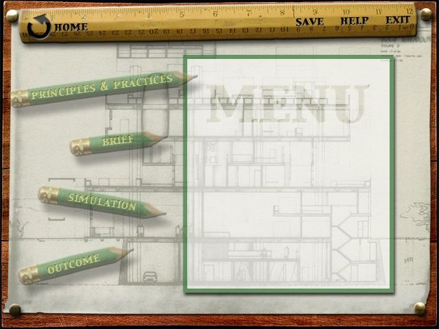
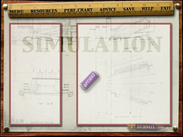
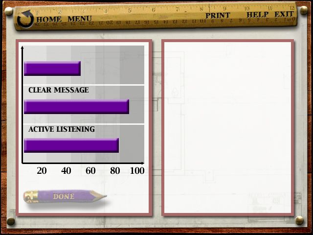
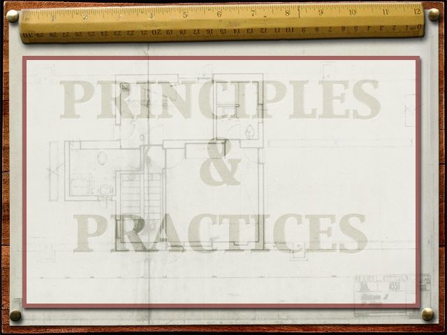
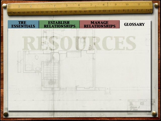
I cannae remember exactly what the back story for this simulation was; but it was something to do with a large building project –hence the metaphor of the drawing board for the interface. Lots of architecty, sketchy type backgrounds and the buttons in the form of hovering pencils, rubbers, rulers etc. Faded out normal states, plus rollovers and pressed versions, which used offsetting the drop shadow back under the pencils etc. to make them visually appear to depress slightly, when you clicked on them. There was also colour co-ordination between the various screens for each section of the sim.
Contrived? Moi?
Below are a selection of screens used in the interface:
Miscellaneous publicity materials
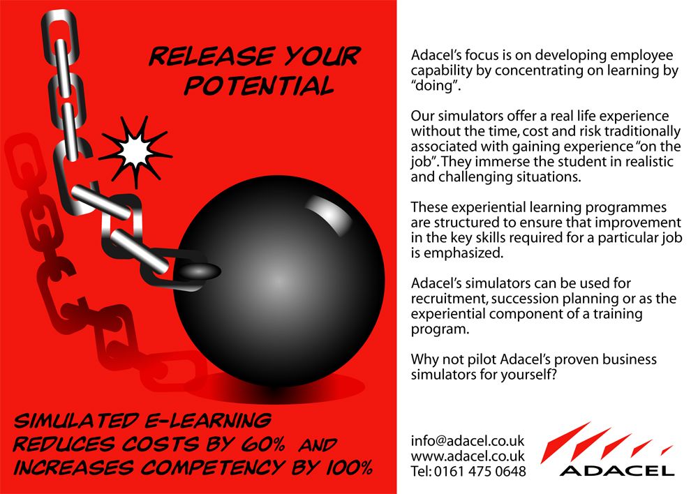
A selection of print ads etc. I created as and when required.
Also introducing "Adacel Arnie" the clock-faced character I invented to promote the time-saving aspects of the simulation training products. We had a big 6 foot high by about ten feet wide backdrop, featuring old Timex-fizzer Arnie, which travelled round to tradeshows and the like. Quite exciting to see your own design reproduced at such a large size.

Two versions of the globe ad; one for use in the Americas and the other for use in Europe.



Revised lightbulb ad –after someone pointed out that the earlier version looked a bit like a cock. Ooops!
