How do you like my saucy new mini-calendars, showing the post-dates on my blog entries? Pretty nifty, eh? — and the cool thing is that it’s all done with good ol’ CSS. No image files were hurt in the making of this website.
If you fancy having a go, here’s what you need to do:
1: First, add the following code into your theme’s custom HTML. If you don’t know how to edit your theme’s custom HTML, you probably shouldnae be doing this anyway but, if you like living on the edge, refer to my previous post for instructions on how to access the HTML editing screen.
The mini-calendar code needs to go inside the title block. Here to be precise:

Replace the highlighted line above with the following code:
<!-- Post title -->
 {block:Title}
<div class="title">
	<!-- begin calendar - displays post date-->
	<div class="MDRcalendar">
		<div class="MDRcalendarmonth">
		{block:Date}{ShortMonth}{/block:Date}
		</div>
		<div class="MDRcalendardate">
		{block:Date}{DayOfMonth}{/block:Date}
		</div>
		<div class="MDRcalendaryear">
		{block:Date}{Year}{/block:Date}
		</div>
	</div>
<!-- end calendar - displays post date-->
	<a href="{Permalink}">{Title}</a>

</div>
{/block:Title}
<!-- End post title -->
[You can use {Month} instead of {ShortMonth} in the above code, if you’d prefer your calendar to display the full month name].
2: If you save the changes and reload your Tumblr blog, you should see that you now have post-dates embedded in the titles of your posts, although the formatting will leave a lot to be desired:

Dinnae panic! The fact that the date is there shows that that part of the code is working, but there are no styling rules applied yet, so the date is just displaying in the same font and colour as the rest of the title. Time for a bit of CSS magic!
3: Edit your theme’s CSS declarations. If you followed my previous post about extracting your CSS to an external file, you need to edit that. If you’re just using the standard Tumblr themed editing features, then the CSS will be inline at the top of the HTML for your theme. Whatever the case, here’s the CSS which I’ve used to style my mini-calendars. It disnae really matter where you put it within your theme’s CSS; I stick it next to the declarations for the post-title, so it’s easy to find:
/*mini-alendar postdate thingy in post title*/
/*calendar box - used for displaying post dates*/

/*the actual calendar*/
#wrapper #content .post .title .MDRcalendar
{
	text-align: center;
	position: relative;
	float: left;
	top: -19px;
	margin-bottom: 5px;
	margin-right: 10px;
	border: 1px solid #ffffff;
	border-radius: 7px;
	background-clip: padding-box;
	box-shadow: #2e2e2e 1px 1px 3px;
}

/*the top section with the month name*/
#wrapper #content .post .title .MDRcalendarmonth
{
	font-size: 0.5em;
	font-weight: bold;
	background-color: #ff0000;
	color: #ffffff;
	letter-spacing: 0;
	border-bottom: 1px solid #bb0000;
	text-transform: uppercase;
	text-align: center;
	padding: 1px 14px 0px 14px;
	border-top-left-radius: 6px;
	border-top-right-radius: 6px;
}

/*the middle section with the date*/
#wrapper #content .post .title .MDRcalendardate
{
	color: #222222;
	background-color: #fcf7ed;
	letter-spacing: -2px;
	font-size: 1.33em;
	font-weight:  bold;
	padding: 3px 0px 2px 0px;
	text-align: center;
	text-shadow: white -1px -1px 1px;
}

/*the bottom section with the year*/
#wrapper #content .post .title .MDRcalendaryear
{
	font-size: 0.5em;
	font-weight: bold;
	color: #ff0000;
	background-color: #fcf7ed;
	letter-spacing: 0px;
	text-transform: uppercase;
	text-align: center;
	padding: 0px 0px 0px 0px;
	-webkit-border-bottom-left-radius: 6px;
	-webkit-border-bottom-right-radius: 6px;
}
/*End mini-calendar postdate thingy in post title*/
I’ll leave it as an exercise for the reader to customise the mini-calendar CSS to get the look you want, to fit your particular theme.
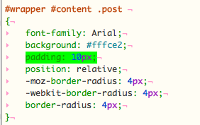
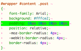
4: One other tweak I made was to add a bit more padding at the top of the post DIV itself, just so the mini-calendar wasnae wedged right up against the top of the post border:
Before

After

Well, that’s all folks. Have fun!
